WEBTRITION
Create, modify & analyze menus.
Roles
UX Designer
UI Designer
Strategy
Information
ArchitectureInteraction Design
Steps
Whiteboarding & Conceptualizing
Mockups
Business Approval & Modifications
Prototypes
UX Designer
UI Designer
Strategy
Information
Architecture
Interaction Design
Whiteboarding & Conceptualizing
Mockups
Business Approval & Modifications
Prototypes
Planning menus can be incredibly complex when working with multiple
locations, meal periods, nutrition standards,
and hundreds of individual menu items. Compass
Group created a website to easily be able to
track, edit, and analyze this
information.
Since Webtrition is such a data heavy application, we had to try to make the
interface as clean as possible.
I worked on this project as a UX/UI Designer on a two person team from March
2019 - Present.
The process at Compass Group was a combination of Agile and Waterfall which
was unusual. The process started with a whiteboarding session. The client would not permit us to conduct user testing, user
flows, or user surveys, so our designs were based solely off of the use cases
and feedback provided by the business. From there, we had to skip
low-fidelity wireframing and go directly to mockups of several options that fit the use
cases provided.
Due to this rather unusual process,
I was not able to conduct the steps that I would typically take to take a
project from start to finish. That being said, working with the team in such
an unorthodox way allowed me to learn about the value of a clear and defined
design process to maximize efficiency and usability. While I worked on
dozens of sub-projects within Webtrition, below are several examples of
the designs that I was responsible for including the Pending Manager
, Forecasting Overrides, and Cost Analysis.
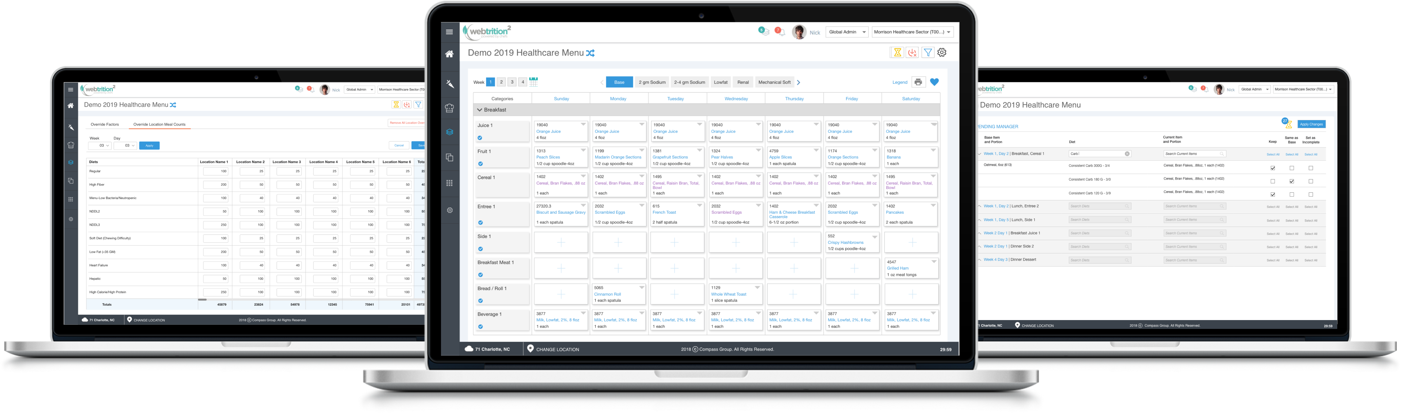
Our task was to simplify a data heavy website that would allow users to easily create, edit, and manage multiple types of menus for multiple locations. The goal was to be able to display the vast amount of information that the user needs to see in a clear and visually appealing way.
Our solution was to create a web application called Webtrition that allows users to utilize our platform for all of their menu and dietary planning needs. I was a member of a two person design team that worked with the business team, functional team, development team, and QA team to ensure that the product works for all intended use cases, is more simple to use than the original version, and fufils the business’ needs.
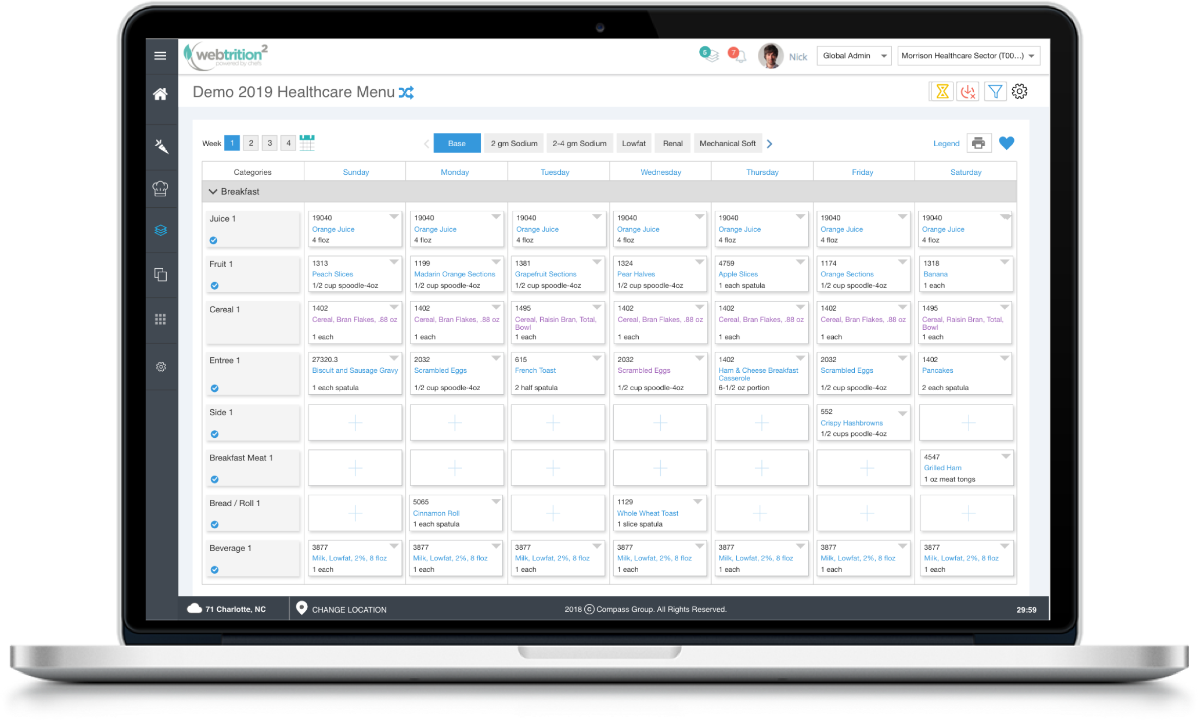
Webtrition is, very simply, used to create and modify menus. The user needs to be able to create these menus for multiple locations, nutrient standards, diets, and meal counts. In order to do this, they need to see all of this information for each meal period for every individual day of the menu. This is a tremendous amount of information as they can have multiple locations with up to 90 diets each which results in hundreds of menu items for each meal period. With the users' needs in mind, we built the following pieces of Webtrition using a combination Waterfall and Agile process.
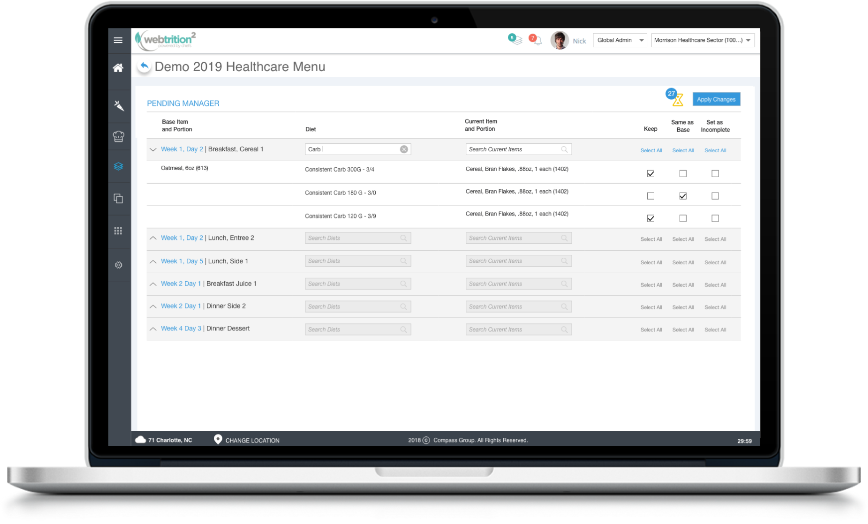
Sometimes when a user makes a change to their main diet, it is unclear whether they want the change to apply across the entire menu or only for that particular diet. In this situation, the affected items are referred to as “Pending.” We needed to create a way for the user to see all of their Pending items together, confirm or deny the change, and save it so that there were no longer any unclear items.
We wanted a way for the user to see all of their Pending items and make changes accordingly. Instead of crowd the screen or create a modal for the Pending items, we decided to create a separate Pending Manager. These were a few of our general designs for the Pending Manager. These whiteboarding images are from my contribution to our whiteboarding session.
The business was opposed to allowing our team to conduct usability tests, user surveys, or user flows, so after whiteboarding we moved on to creating mockups. Working within the set style guide, I created this interface to allow the user to see the individual week & day where the pending item took place, see the diet and menu item that is problematic, and make bulk changes directly from this screen.
I built out this interaction after presenting the first mockups to the business. The prototype allows the team to see how the interaction would work so that we can ensure it is implemented correctly in development. You can see the prototype here.
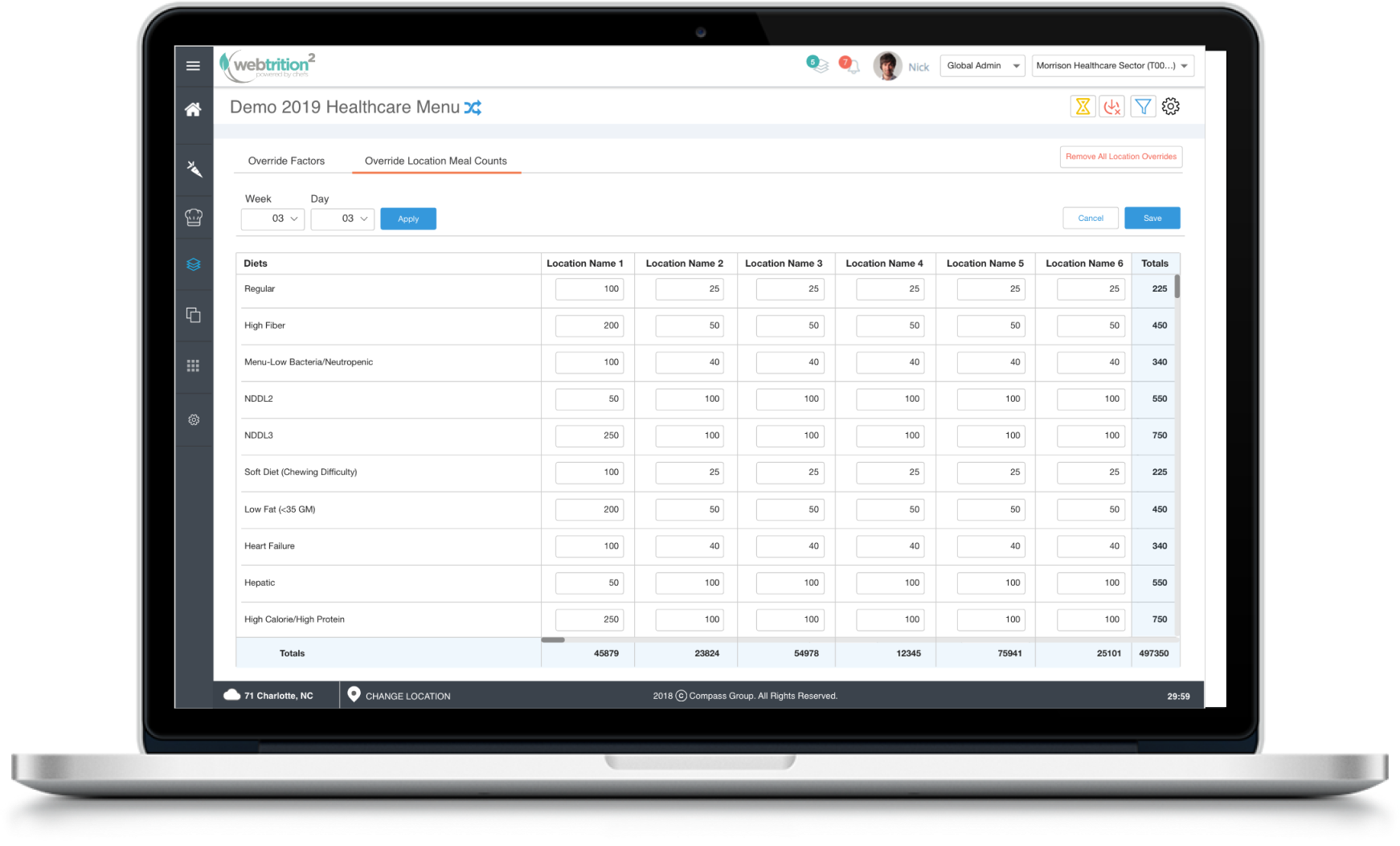
When creating a menu, the user needs to estimate how much of each menu item to make. In doing this, they need to find the balance between running out of that menu item and having too much left over. If their estimate is wrong, they need to override the numbers they’ve set to make the data more accurate. To allow for these updates, we created a screen to override this data.
For this interaction, the user needs to select a date in order to see the current data for that menu and make changes. We went through several iterations of this date selection design after running into both business dissent and developmental road blocks. All of the original interactions were all intended to end on this screen that allows the user to change the Total Census and all of the individual “Total Meals” for each menu item. Please see the different design iterations created below due to changes in use case and developmental road blocks. The user can also expand this view to see a further breakdown of the data by location.
After several re-designs and changes to the design, I was able to create a final prototype. Please see the prototype for Forecasting here.
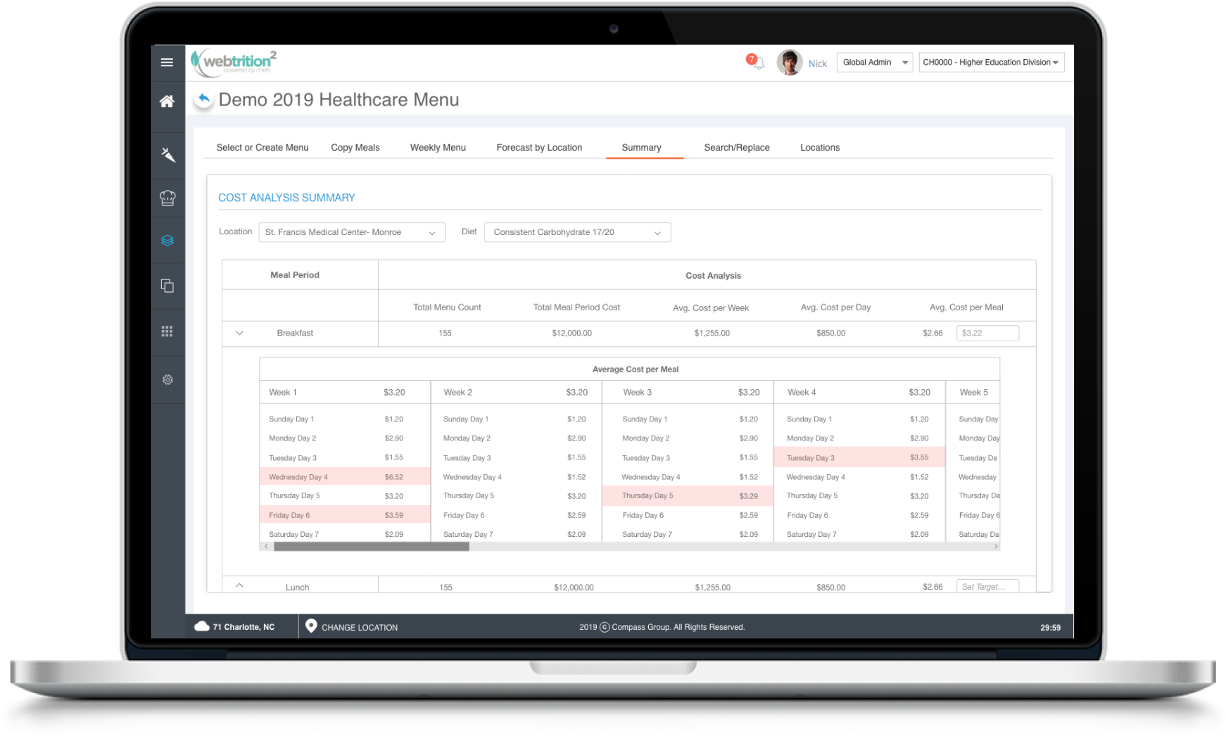
The user also needs to keep track of the budget when planning menus. The user needs to set a target price for average cost per meal, see which days and weeks are above the target price, and navigate elsewhere to make the necessary changes. Once again, this is an incredible about of data to display as the user has multiple locations, diets, and up to 16 weeks to view. To show this data efficiently, we created a screen to display the Cost Analysis summary. This was a re-design of an existing screen that was both inefficient and did not contain all of the necessary data. I was acting as lead designer on this project and was able to insist on low fidelity wireframes before creating mockups.
For this interaction, the user needs to select a date in order to see the current data for that menu and make changes. We went through several iterations of this date selection design after running into both business dissent and developmental road blocks. All of the original interactions were all intended to end on this screen that allows the user to change the Total Census and all of the individual “Total Meals” for each menu item. Please see the different design iterations created below due to changes in use case and developmental road blocks. The user can also expand this view to see a further breakdown of the data by location.
After several re-designs and changes to the design, I was able to create a final prototype. Please see the prototype for Production Counts here.
This project was quite different than the work I had previously done for several reasons. Firstly, I had not experienced a business who insisted that we skip aspects of the design process like usability testing and low fidelity mockups. Secondly, I had not worked within a set style guide to maintain consistency as I was always starting a project from the beginning and not joining in the middle as I was for Webtrition. At the outset, we were concerned about being able to display so much data at the business’ request without overwhelming the user, but by designing with usability in mind we were able to create something that is both informational and simple at the same time.