Many cloud storage apps available today do not address all of their
users needs which forces users to utilize multiple apps. We wanted to
solve this problem and create an app that will allow users to use just our app
instead of juggling several different ones for different purposes.
Our task was to create a cloud
storage app that would be a major
competitor to apps like Google
Drive, Pinterest, etc. The primary
features were to save web content,
organize & create content, upload
files, and allow users to
collaborate. Our goal was to
combine these features and more
to create a compelling and user
friendly cloud storage app.
Solution
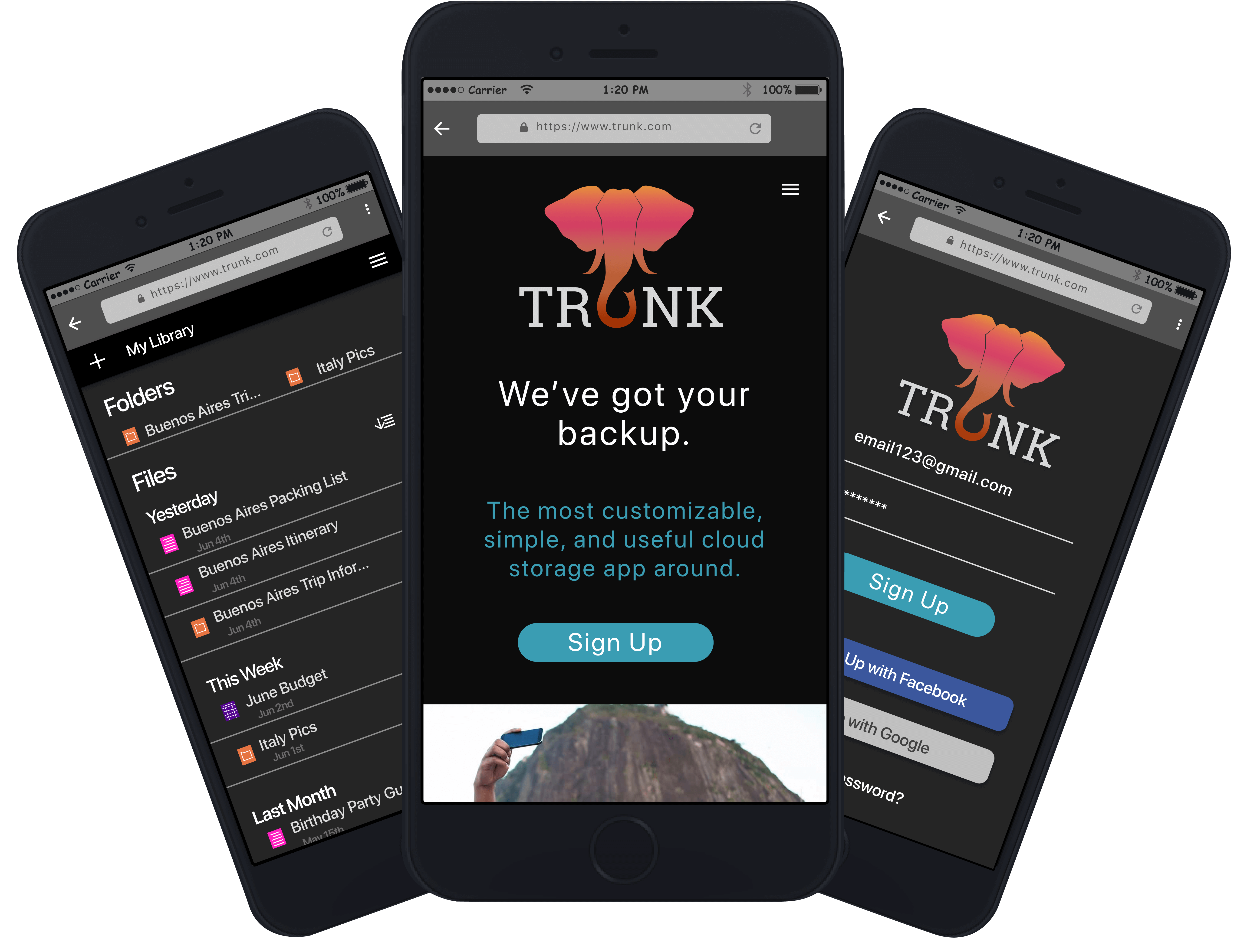
Our solution was to create a simple,
user friendly cloud storage app
called Trunk that allows users to
use our platform for all of their
needs. Our research indicated two
major findings. First, many people wanted a
collaboration feature. Second, the main concern
with cloud storage is security.
Using this information, we designed
an attractive and useful app that
will become a main competitor for
the cloud storage apps available.
Trunk was developed out of desire to create
a cloud storage app that would combine the popular features of other apps into
a simple but highly useful one to serve all of our users' cloud storage
needs. We started with that idea and built Trunk with
the following steps.
1. DISCOVERY & RESEARCH
User Survey
Before starting our design, we wanted to ensure that we were designing what
the users want. In order to find which features are most useful, we created a
cloud storage survey that asked whether respondents used cloud storage, why
or why not, which features they preferred, and more.
82%
use a cloud storage app
92.9%
want to share content
85.7%
want to access files remotely
92.9%
mostly use file & photo storage
82%
find collaboration useful
95.8%
share via link or social media
Competitive Analysis
After our survey data was complete, we went on to perform
a competitive analysis
of other current cloud storage apps for
their strengths and flaws. We conducted a SWOT analysis of
two different cloud storage apps-- Google Drive and Dropbox.
Their primary strengths where
brand name recognition, automatic saving, having nothing to download, and no cost
whereas their primary weaknesses were the inability to save web content and limited security options. We took these results into account when deciding on
our app structure.
User Personas
We wanted to understand our users to make sure we were designing
Trunk with them in mind, so we created user personas.
ROBERT
THE STUDENT
32 years old | Rockville, MD
Motivations
Robert, a current user of Google Drive, wants to have
his assignments stored in the cloud. He needs to share
his assignments with professors and collaborate on group
projects.
Goals
• Backing up assignments
• Collaborating with his peers
• Sharing assignments with his professors
Frustrations
• Unable to easily save articles & resources
• Wants to have his files in the same place
LILY
THE PLANNER
32 years old | Charleston, SC
Motivations
Lily, a current user of Google Drive, Pinterest, and Evernote,
is planning her wedding and is all about
organization. She organizes her calendar, inspirations,
guest list, etc. with multiple apps. She wants to keep
everything in one place.
Goals
• Successfully plan her wedding
• Have her files in one place
Frustrations
• Has to use multiple programs for her files
• Can't easily share files with her fiance
User Stories
We then created user stories
to determine which actions are high, medium, and low priority.
Some high priority user stories included:
• As a new user, I want to sign up for an account
• As a returning user, I want to create new documents
• As a returning user, I want to share my files with others
• As a returning user, I want to access my files from anywhere
• As a returning user, I want to upload files
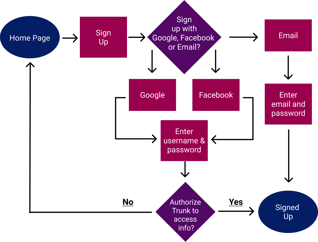
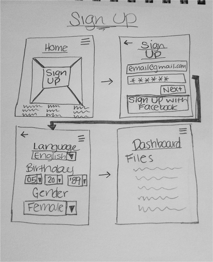
User Flows
These user stories were then converted into user flows
to map each process from point A to point B.
After we had completed our research, we were ready to begin designing. We used
our flow diagrams to create wireframes for each of our high priority user stories
creating a clickable prototype in which our users act out
all of the high priority actions.
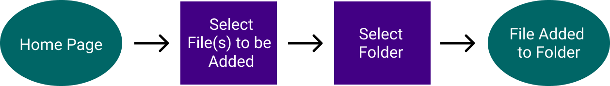
Usability Testing Round 1
We wanted to test this prototype to make sure that our proceses were user
friendly, so we conducted usability tests
asking our participants to compelete the following tasks:
Task #1:
Create an account
Task #2:
Upload a document
Task #3:
Add a file to a folder
Findings:
33%
wanted the ability to sort the dashboard
66%
wanted to organize content by selecting the file first
33%
thought we should rename "Add New" to "Upload New"
100%
felt that the sign up process was too long
Improvements:
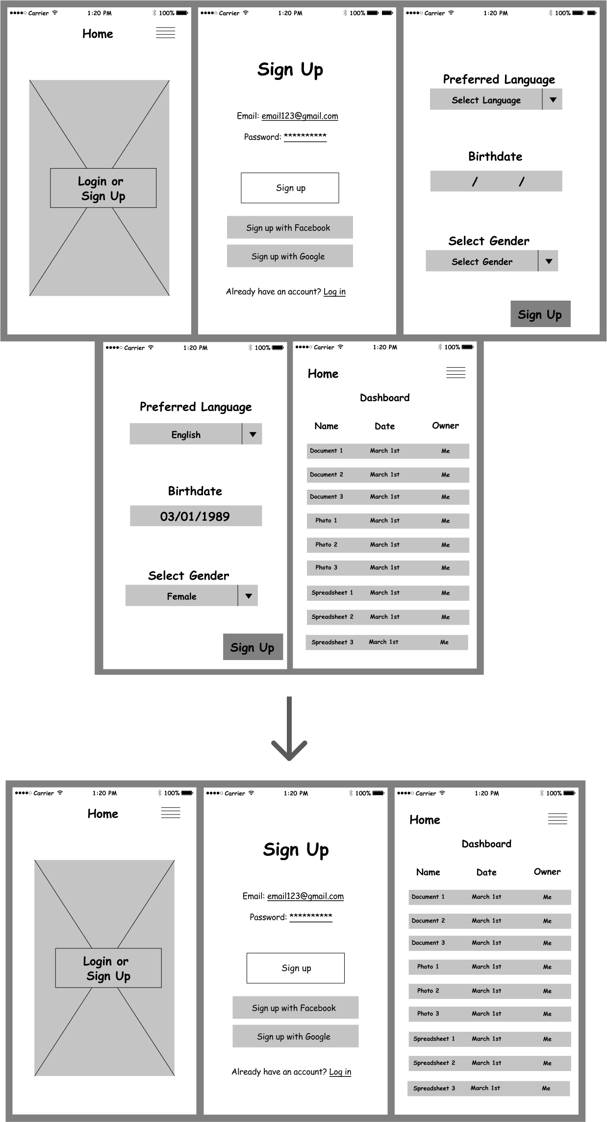
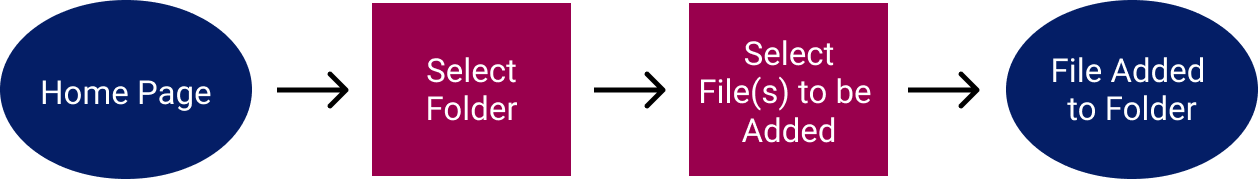
The primary change we made based on this feedback was to change the
process of organizing content tostart by clicking the file and selecting the folder
instead of clicking the folder and selecting which files to add.
Another key change that we made was to shorten the sign up process.
We removed the necessity for our users to enter their language, birth date, and gender and simplified the process.
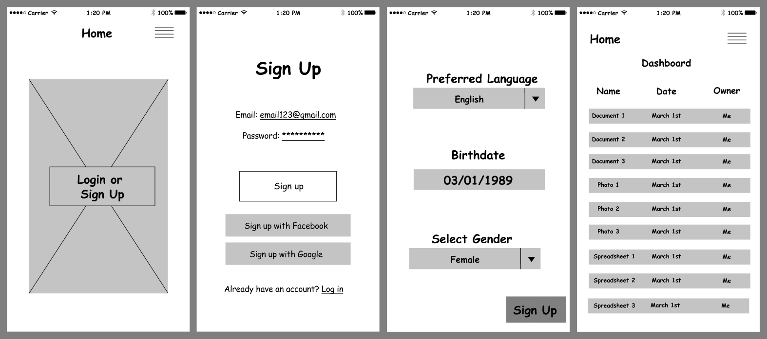
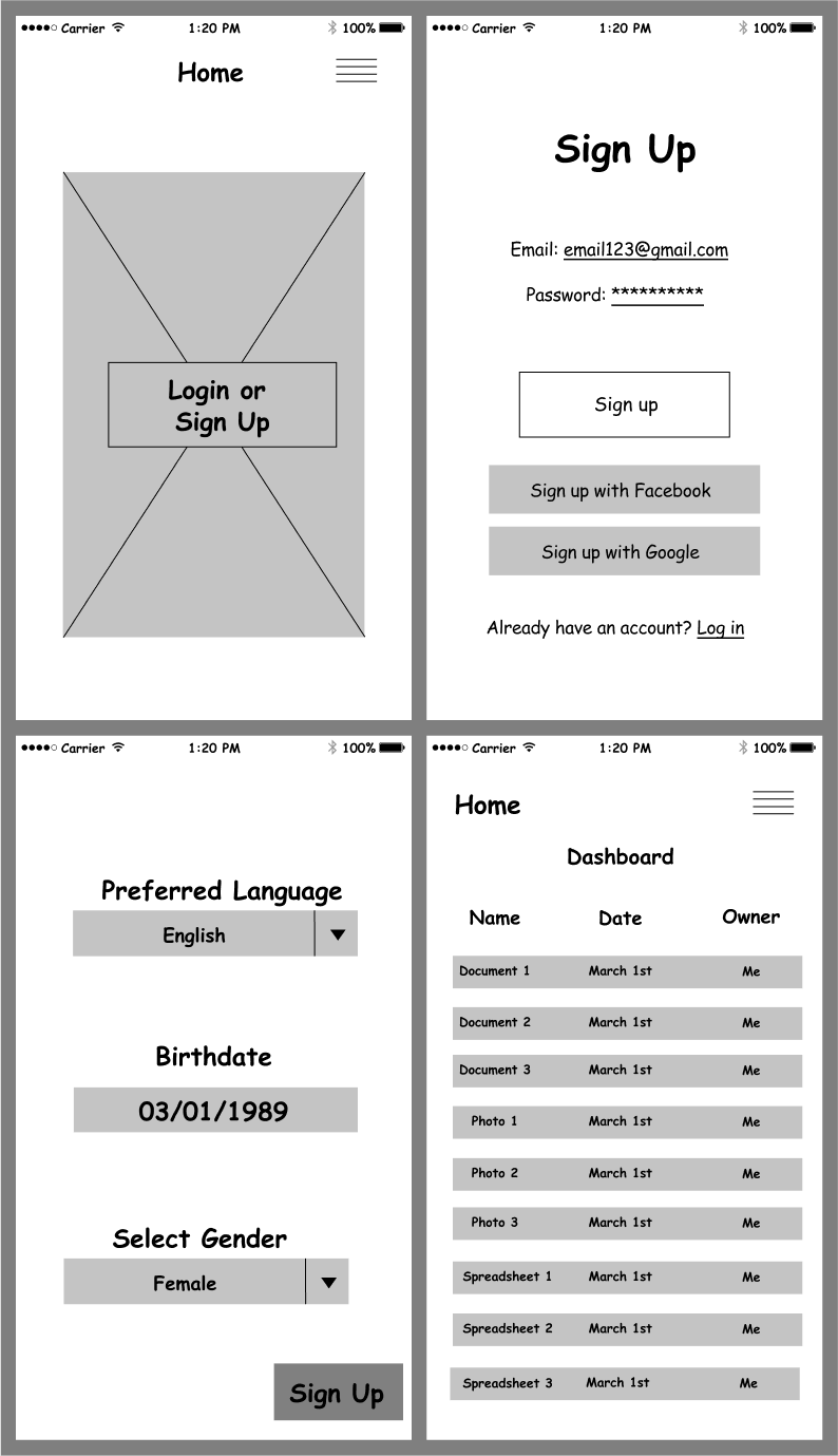
We moved forward to create mockups of our designs. First, we needed to
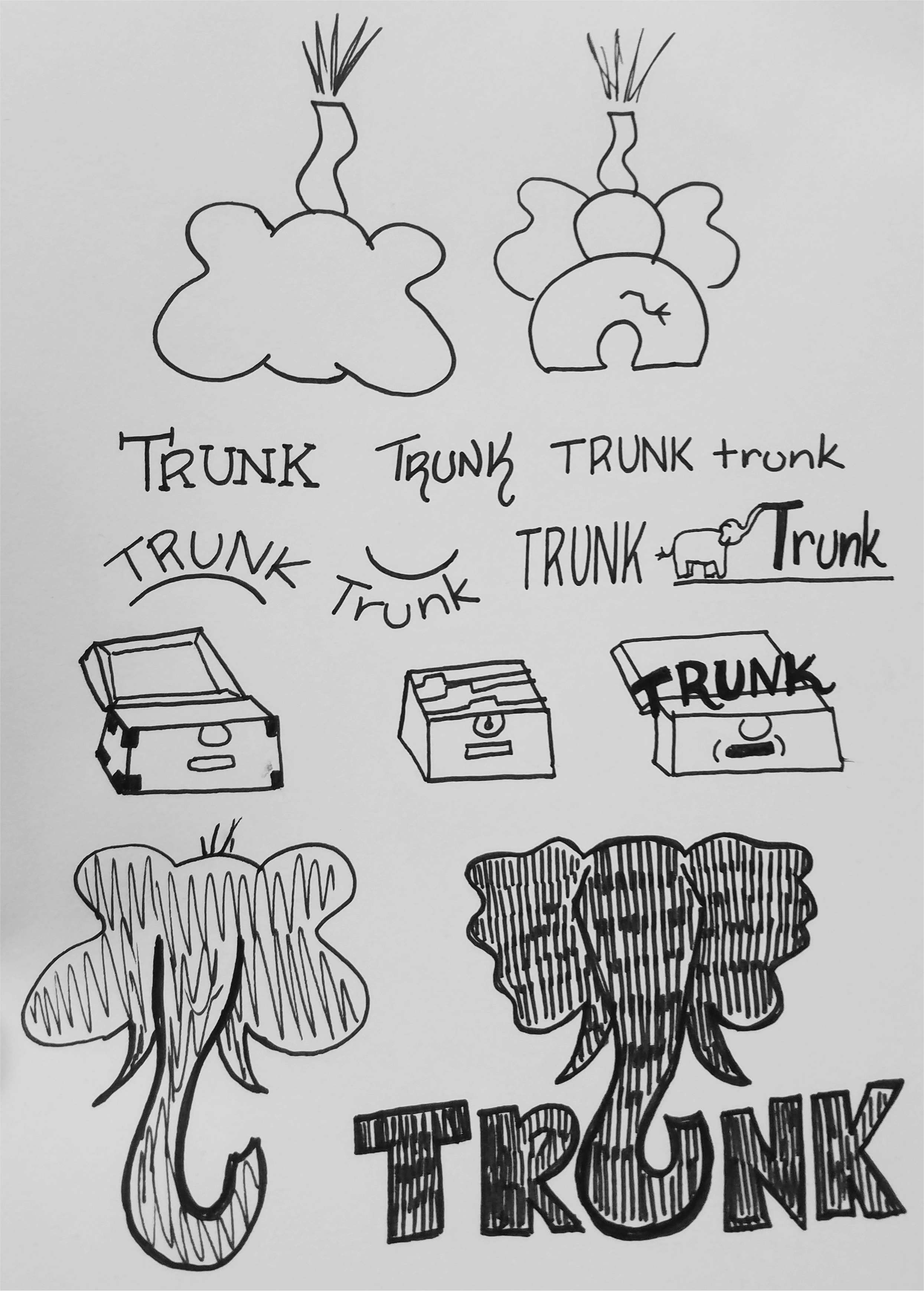
decide on solid branding for our app which first needed a name
and a logo. The name "Trunk" works in two ways: Elephants have a reputation
for having a long memory, and a trunk is used for storage. Storage and
memory together are exactly what we’re creating.
We then focused on our logo,
which had many different iterations but eventually became the silhouette of an
elephant with the trunk creating the letter U in Trunk. My original sketches and
finished logo are below.
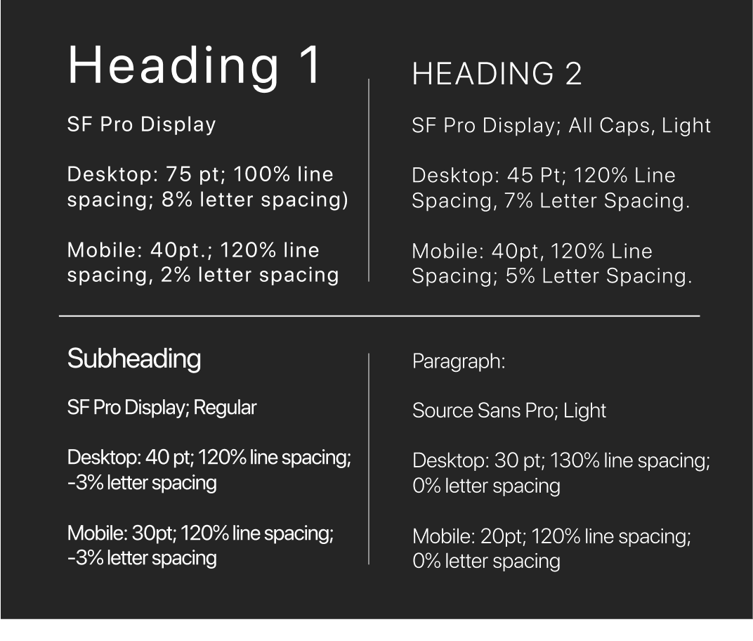
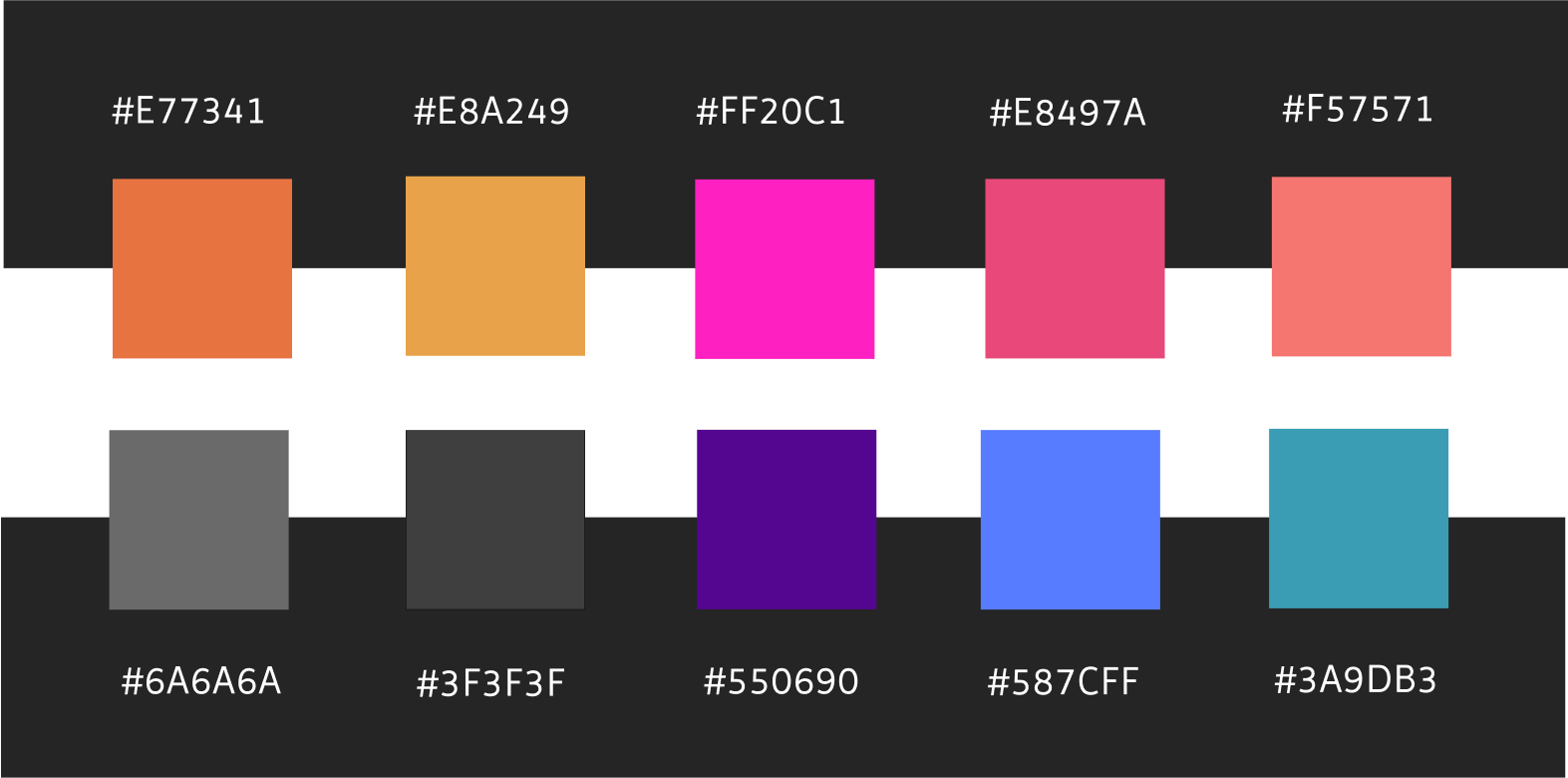
With our logo in place, we moved on to create a color scheme, typography,
buttons, and much more. We created a comprehensive style guide
to organize all of these design decisions. Using this branding, we moved forward to create our
mockups.
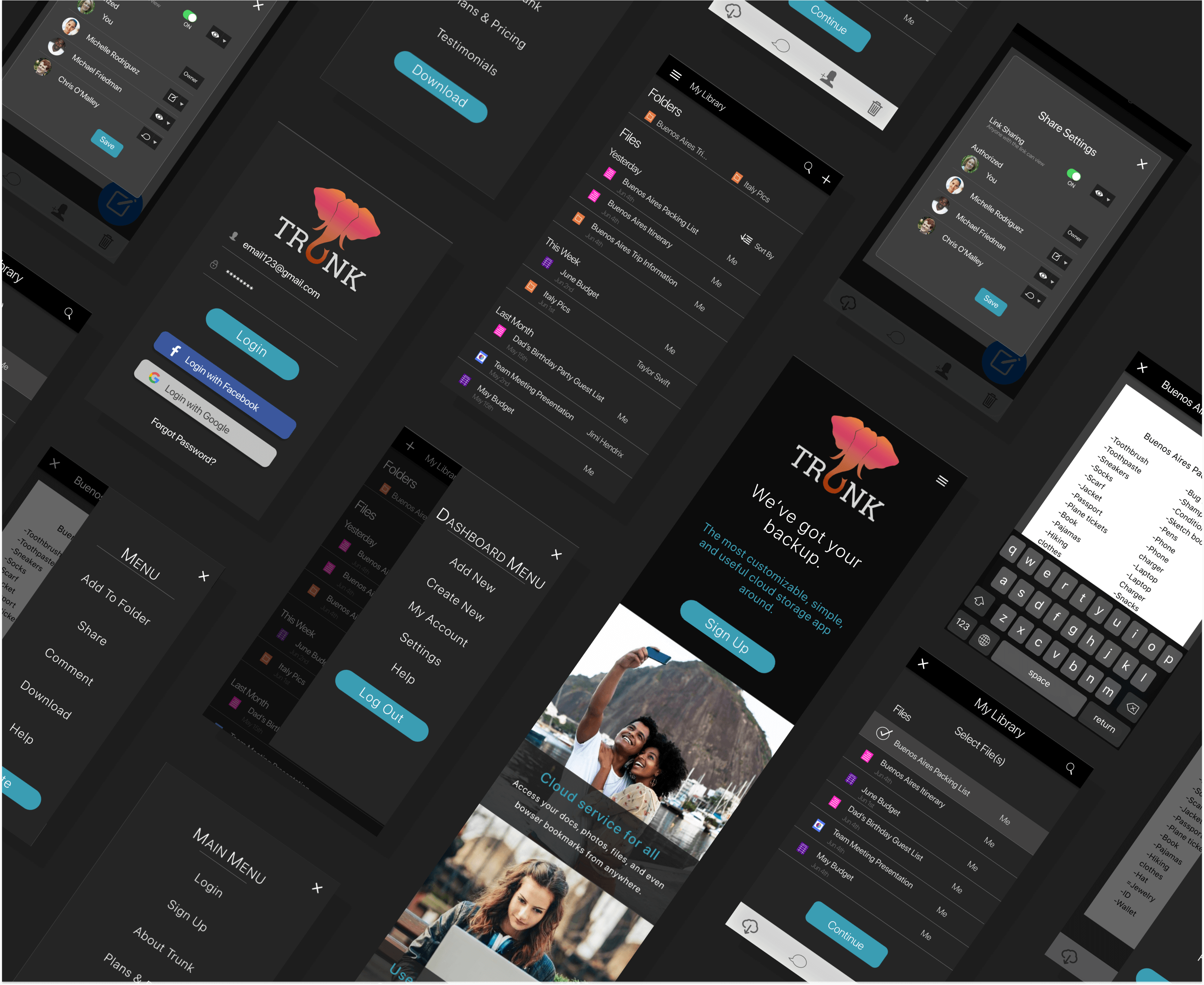
Mockups
Keeping in mind our style guide and branding decisions, we went forward to
design over 80 individual mockup screens that would become our prototype. These
were more colorful and attractive than our wireframes. After many drafts and
changes, we created our second clickable prototype.
Usability Testing Round 2
When we were finished, we conducted another usability test
to see how potential users would interact with our finished design.
Findings:
33%
wanted the option to sort dashboard in different ways
66%
preferred a darker background
33%
organized content by selecting the folder first
66%
organized content by selecting the file first
Improvements:
We took this feedback into account and incorporated them in our design. The most
critical change was to utilize both options for organizing content.
After many drafts and multiple tests, our final prototype was ready.
Throughout this project, I learned that creating the skeleton
of a project is arguably the most important part of the design process, as without a solid foundation, the project
collapses. Everything needs to be thought out in detail and the designs need to
be consistent throughout to make a user friendly experience.
At the outset, we were doubtful that there was need for such a product or that
we’d be able to create a worthy competitor for the current cloud apps available.
However, after all of our hard work, we were pleasantly surprised to find that
we did find the right combination of features and feel confident in Trunk’s
potential.