RIDDLEMECASH
Get more than just bragging rights.
Roles
UX Designer
UI Designer
Branding
Information
Architecture
Steps
Competitive Analysis
Wireframes
Branding
Mockups
Client Presentation
UX Designer
UI Designer
Branding
Information
Architecture
Competitive Analysis
Wireframes
Branding
Mockups
Client Presentation
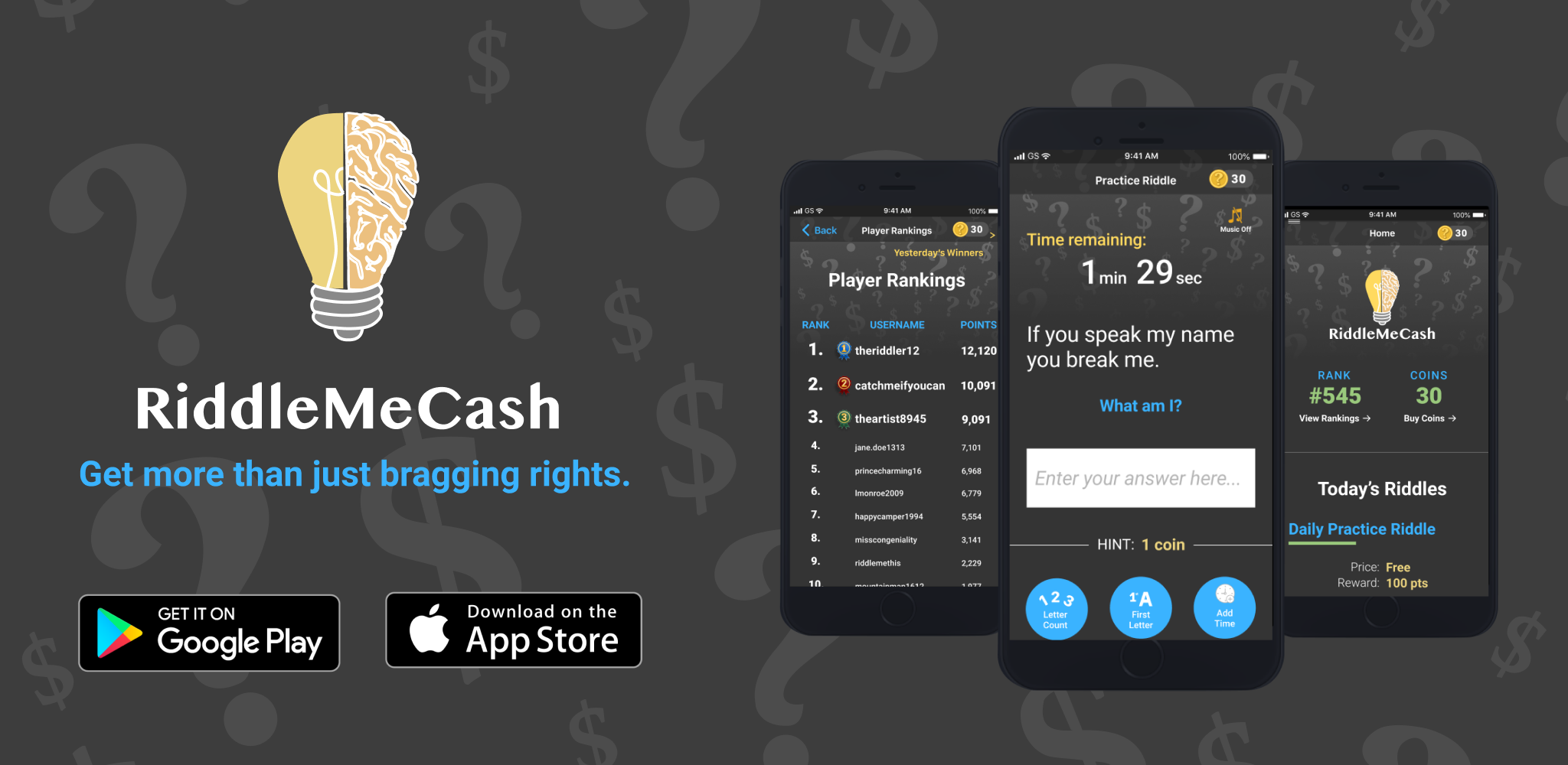
RiddleMeCash is a game, currently available in android and iOS
app stores, that allows the user to put their money where their
mouth is. The game generates a daily riddle and the user can bet
on their ability to solve the riddle successfully using coins
purchased in the app store. The user can also purchase bonuses
like extra time or a hint to improve their changes at getting the
riddle correct. Then, the daily rankings are released and the user
can brag to their friends and family knowing that they are the best
riddle-solver in the group.
I worked with the client very closely on this project, helping them
to not only create the UX and UI but also to help flesh out the idea
in general. During my time with RiddleMeCash, I created Wireframes
and Mockups for both Android and iOS devices as my final deliverable,
working with the overseas development team to ensure they were
implemented correctly. I started by conducting a Competitive Analysis
of similar games, creating User Stories & Flows,
Wireframes,
skipping User Surveys and User Personas at the client's request. Then,
I proceeded to create the Branding + Logo Design and
High Fidelity Mockups for both iOS and Android devices.
Throughout the process, I used Figma and Sketch to bring the project to life.
Our task was to create a game that allows users to bet on their ability to solve a complex riddle correctly, purchase coins to keep playing, and display a leaderboard to show user rankings. While there are similar games available today, none combine the human instinct for competition, cash rewards, and mind-scrambling riddles all into one. The goal was to create a simple, fun, user friendly app with our users in mind.
Our solution was RiddleMeCash-- A clean yet approachable and completely original app game that allows our users to put their money where their mouth is and bet to win both money and bragging rights with their friends and family. Our competitive analysis indicated that most gaming apps have a whimsical and colorful appearance as well as some unfortunate user experience problems. We decided to create a colorful yet professional interface that is more user friendly than our competitors.
We created RiddleMeCash with the idea that our users would spend money to earn coins that would allow them to play a riddle and increase their earnings if they are correct while competing with friends and family. We started with this simple idea and then followed the following process.
We started the process of creating RiddleMeCash by conducting a
Competitive Analysis of other games on the market. We conducted a
SWOT analysis of two different apps: Just Riddles and Brain Teasers.
Just Riddles’ strengths included a higher app store rating and a high
number of customers. However, their weaknesses included quite a bit of
heavy/bold text that makes the screen feel cluttered as well as a confusing
user experience. In addition, they did not have any way of enticing their
users to pay for additional features and rely heavily on inconvenient advertisements.
Brain Teasers’ strengths included a colorful and fun color scheme and
high number of riddles as well as a clear method of increasing your score. Their weaknesses
included that it is a very simple game that is easy to get bored with,
plus whimsical and childish UI. In addition, they too did
not have a way to earn money lacked any competitive aspect.
After reviewing this research with the client, we decided that our app
UI needed to be more professional than its competitors while still maintaining
an element of whimsy. We wanted to include competitiveness as a motivator and
allow the user to continue playing if they purchase additional time. Many of
our competitors have perfectly adequate apps, but we want to create something
that is more enticing, more interesting, and overall more fun for the user.
I worked with the client to identify the highest priority features for the app and created User Flows in Figma to map out the step by step process on how these actions can be completed.
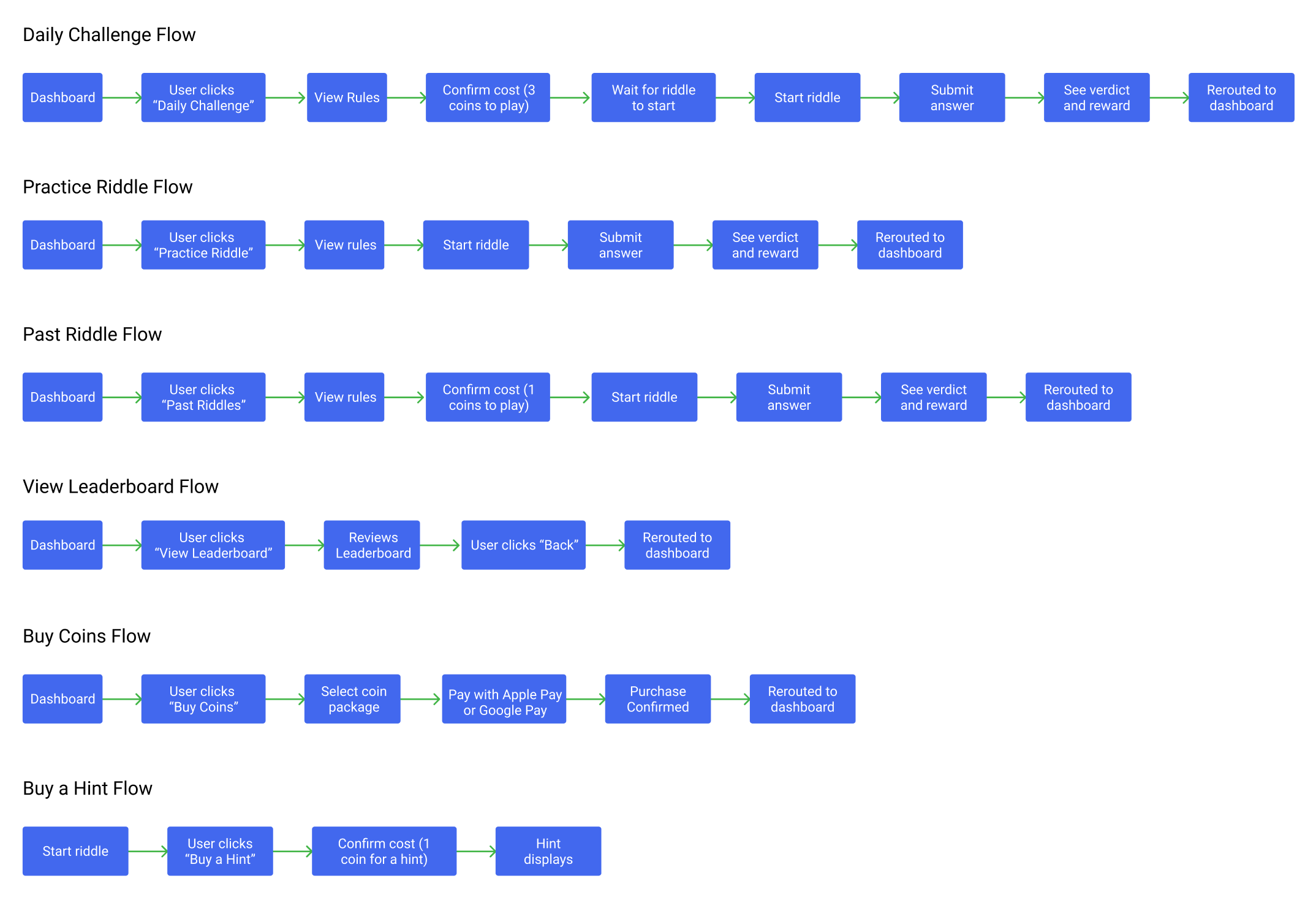
After our preliminary planning was complete, the RiddleMeCash team continued on to create Low Fidelity Wireframes in Figma.
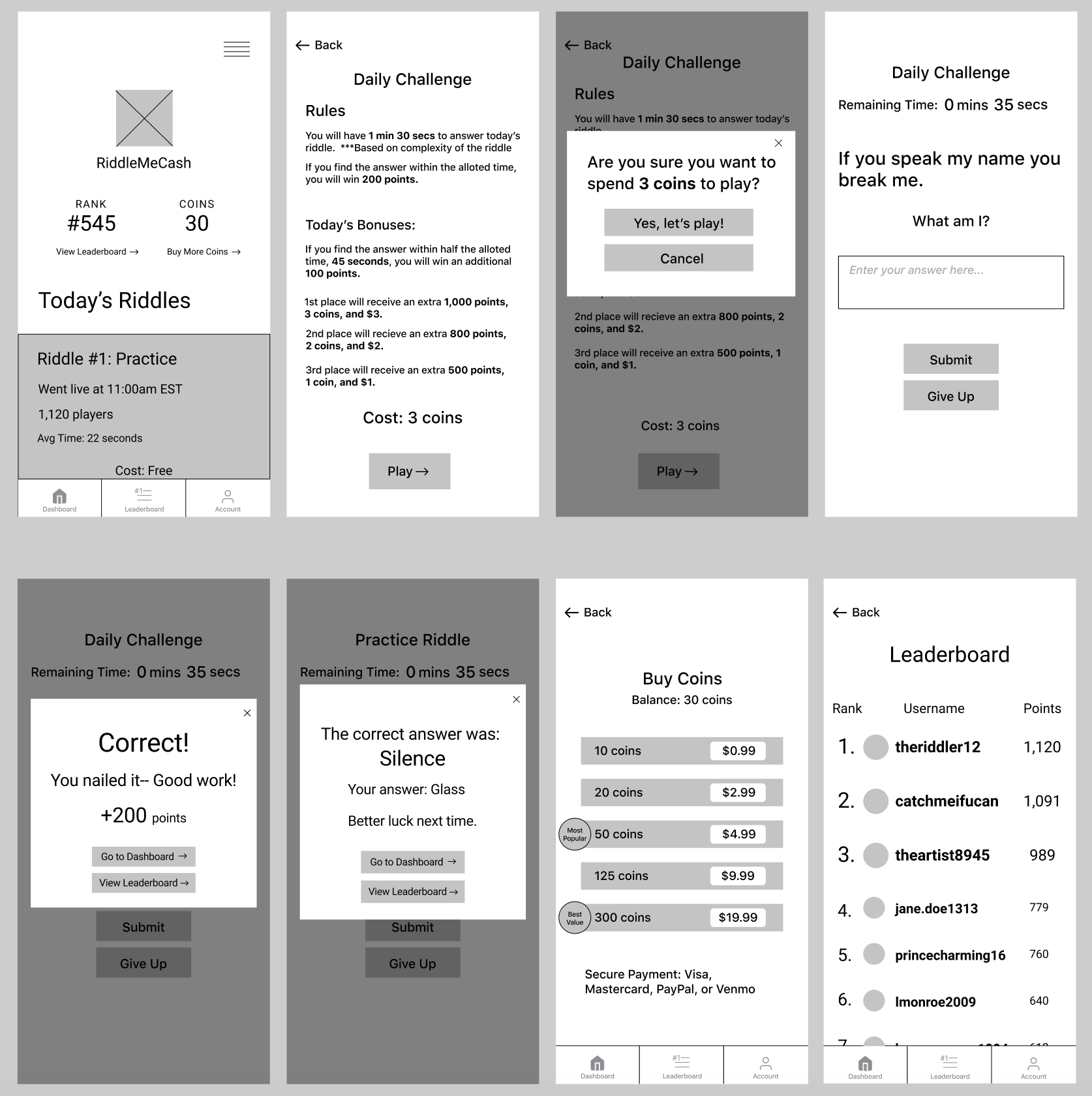
After presenting the wireframes to my client, I proceeded to work on the Branding for RiddleMeCash. The client had already decided on the name for RiddleMeCash, so I began working on a logo. After presenting some sketches to the client, we decided on the logos below.
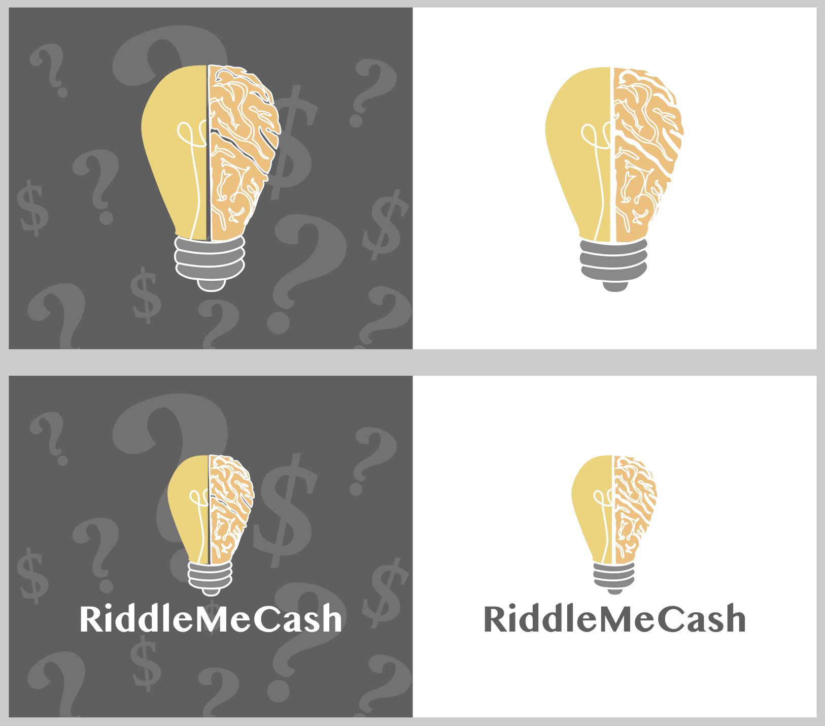
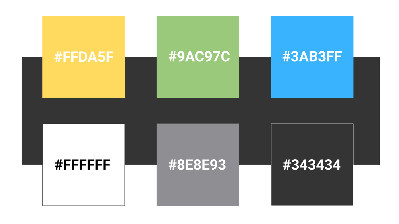
Alongside the logo, we also needed to decide on a color scheme. We knew that we wanted something that was still fun but more professional and classy than some of those we had seen from our competitors. After some deliberation, we chose the color scheme below.
After finishing branding, we created mockups for both Android and iOS devices. You can peruse my mockups for both Android devices and iOS devices in separate Figma files.
This was the first project I worked on in which I was collaborating directly with the client. The most interesting thing that I learned throughout this experience was that the client does not always know what they want and it is my job to guide them to a solution if necessary. I also learned the necessity of consulting with the client frequently to ensure that their vision, as well as my own, are being carried out in tandem. I can say that I am proud of this project and think that RiddleMeCash fills a gap in the market that was otherwise untouched.